

Service Level Topology
Visualizing the service consumption and measurement topology while avoiding the most common SLI/SLO pitfalls

This post connects the service level terminology to a visual representation that allows getting to meaningful SLIs and setting reasonable SLOs.
At the heart of the Service Level Assessment is a graph.
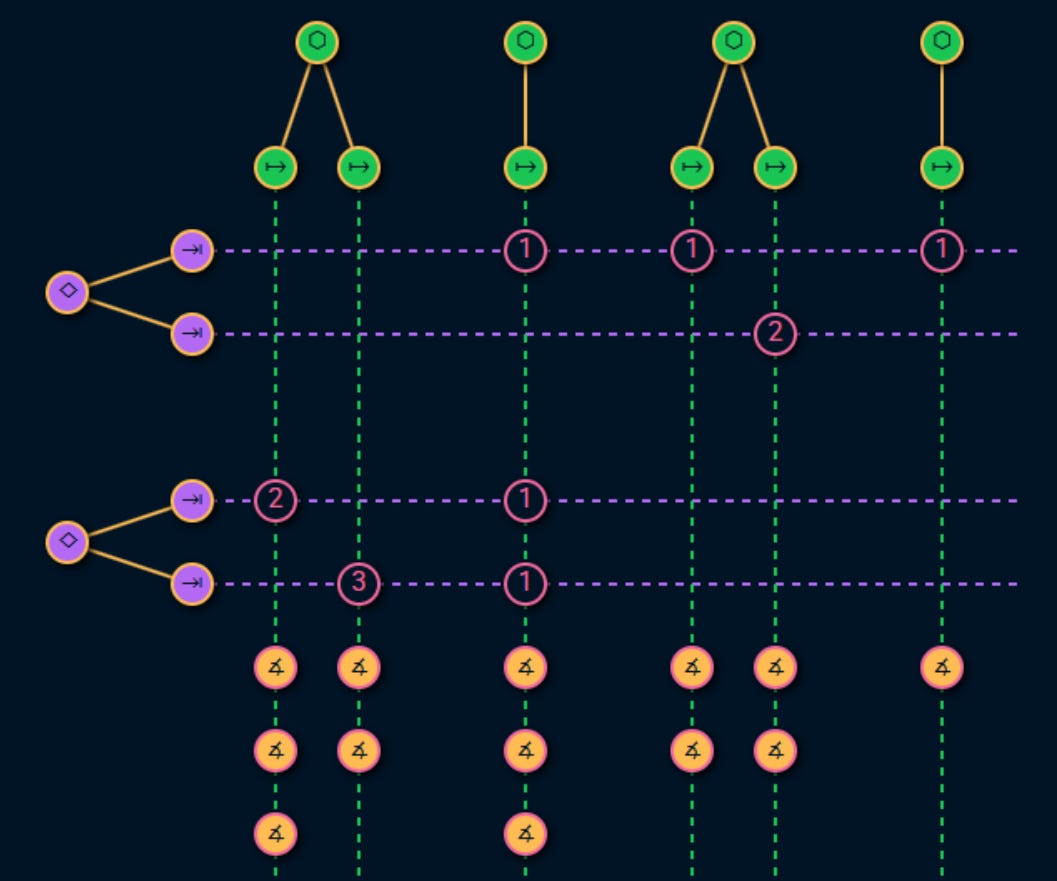
High level view
This graph uses the service level terminology we have already established to visualize the service consumption and measurement topology in 4 sections:
What offers the service?
What uses those service and why?
How do those usages fail and what are the symptoms, consequences and business impact of those failures?
What metrics can be used to measure those failures?
Let’s go through them one by one.
Sections
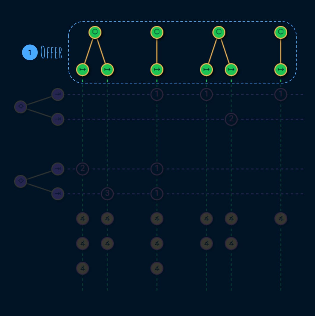
1. Offer
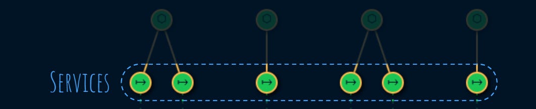
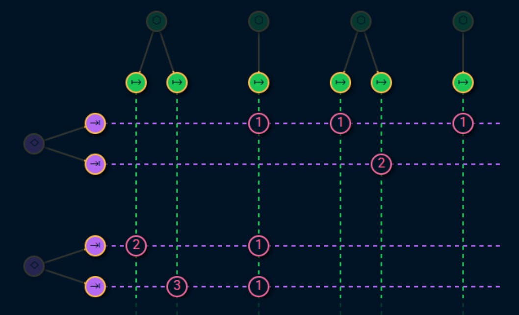
At the top we have the service providers like backends, databases, hardware, etc.
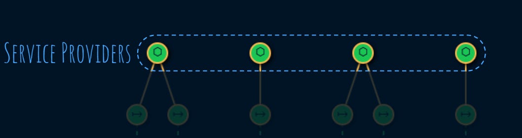
Each service provider, provides one or more services:
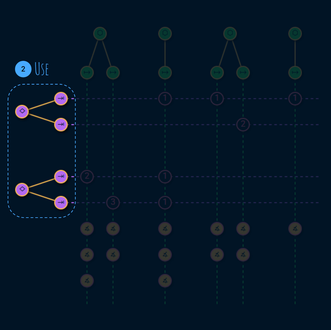
2. Use
On the other side we have the service consumers like end users, or other teams that use our services to build other services toward their consumers:
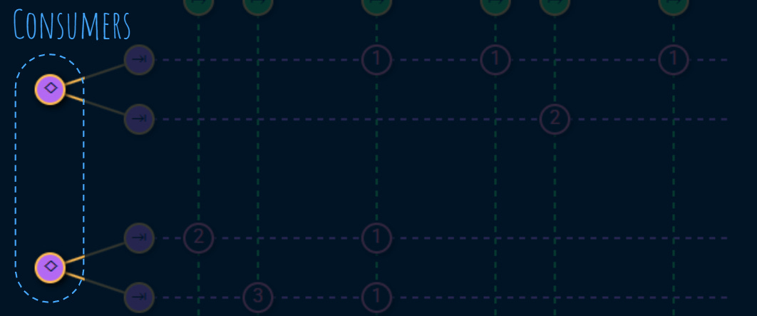
Each consumer has 1 or more tasks. These tasks are very important because they are the reason that the service is exists:
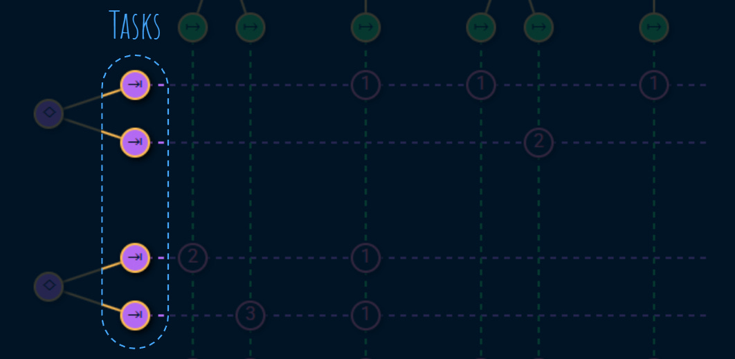
As we’ll see, good SLIs tie to why a consumer consumes the service in the first place. Reliability and performance is perceived from the consumer’s perspective in terms of the tasks they care about.
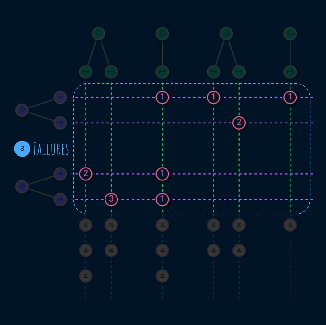
3. Risks
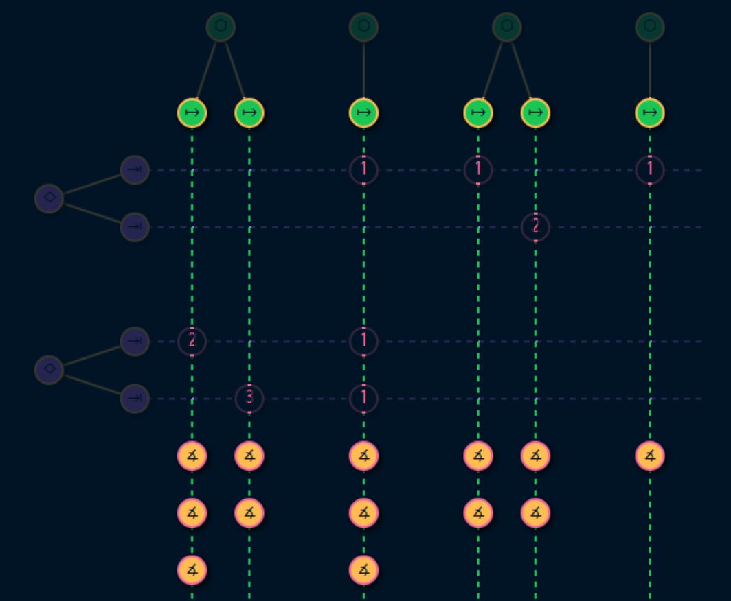
Each task uses one or more services. There’s a risk that the service fails to do its job.
A usage establishes a link between a service and a task:
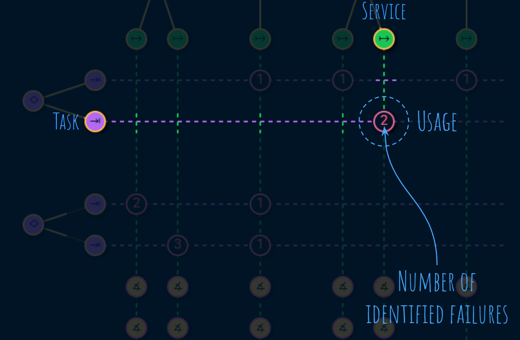
The number on a usage node indicates the number of failures that have been identified on a given usage.
These usages and failures are an important part of the service level assessment:
Each failures has:
Symptom: how does the consumer notice the failure?
Consequence: how the failure impacts the task?
Business impact: how the business bottom line is impacted?
A good assessment takes quite some time to get right and we highly recommend to have the service consumer in the room to make sure that you understand their goals (tasks), what services they use (usage), and how they perceive failure.
Failures are measured by metrics.
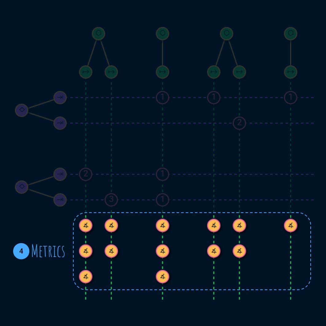
4. Metrics
Metrics help the service provider be on top of their service level by measuring the failures that were identified for each usage in the previous step:
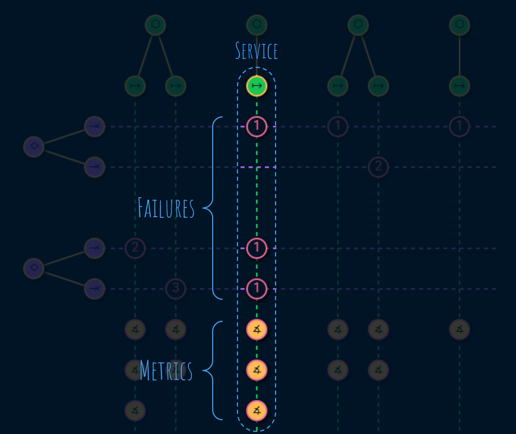
Metrics identify service degradation or disruption.
SLO communicates commitment to a specific level of service (target) over a specific time window (compliance period).
Alerts tie that commitment to accountability. That’s why it is very important for the metrics to measure failures that threaten the consumer tasks.
Metrics are a key outcome of doing the service level assessment.
Recap
Create your own graph using my open source and free project over here:
Stable version (🛑not deployed as of early August 2025)
My monetization strategy is to give away most content for free. These posts take anywhere from a few hours to a few days to draft, edit, research, illustrate, and publish. I pull these hours from my private time, vacation days and weekends. The simplest way to support this work is to like, subscribe and share it. If you really want to support me lifting our community, you can consider a paid subscription. If you want to save money, you can get 20% off via this link. As a token of appreciation, subscribers get full access to the Pro-Tips sections and my online book Reliability Engineering Mindset. Your contribution also funds my open-source products like Service Level Calculator. You can also invite your friends to gain free access.
And to those of you who support me already, thank you for sponsoring this content for the others. 🙌 If you have questions or feedback, or you want me to dig deeper into something, please let me know in the comments.